
I used to be the undisputed queen of messy reports.
But now, I’ve decided to throw away that crown.
I mostly relied on Power BI’s default features, which are okay—but, aesthetics matter. After watching other reports for inspiration, I realized one important thing:
👉 Your report must have aligned titles, tooltips, text, and consistent color grading.
Let me show you my previous reports.
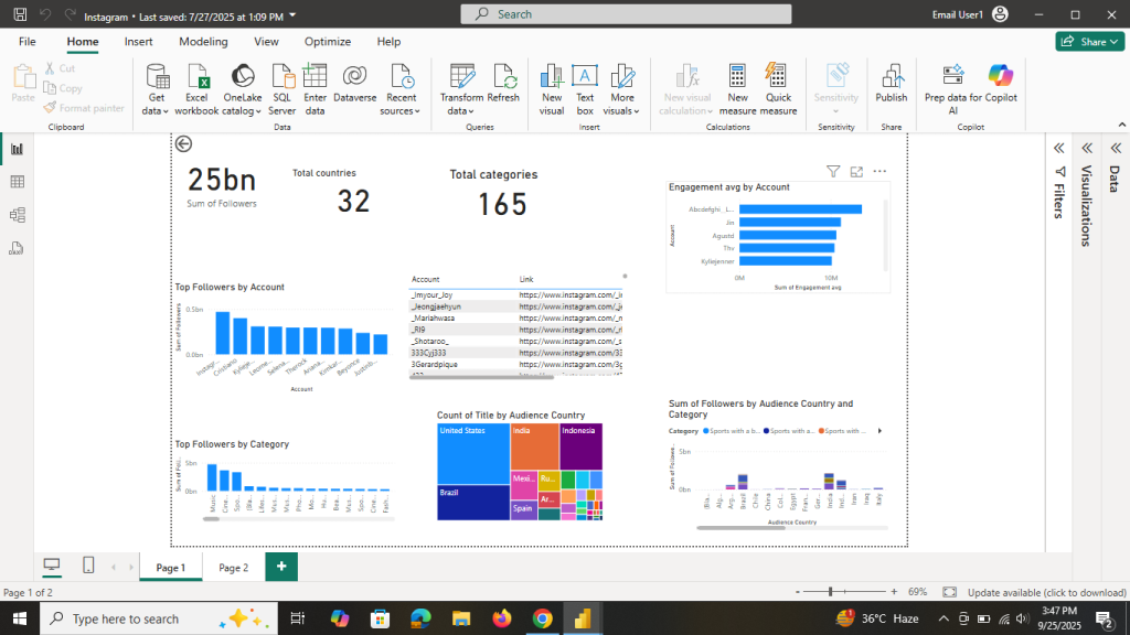
I took a screenshot of this report, but I don’t know where I saved it.
Let us start.
Table of Contents
Step 1: Change the Page Size
- Go to Canvas settings
- Select Custom (Height: 1200, Width: 1000)
- Background: Choose a solid color (check transparency settings → set to 0)

Originally, I had a 5-page report, but after adjusting the page size, I converted it into a single-page report.
Step 2: Add Rounded Rectangles
- Go to Insert > Shapes > Rectangle
- Format it as:
- Shape → Rounded corners 15%
- Fill → Dark gray
- Size → Height: 100, Width: 225

- Shape → Rounded corners 15%
- Align it properly:
- Format → Align → Top and Horizontal
- Format → Align → Top and Horizontal
Step 3: Add a Sidebar
- Insert a rectangle shape on the left side to use as a vertical sidebar
- Copy it to all pages
- Keep the background color consistent with the previous rectangle
Step 4: Keep Titles & Tooltips Consistent
- Titles: Segoe UI, size 10, alignment → Middle

- Tooltips:
- General → Tooltip → Options → Default

- Font → Segoe UI, size 10
- Label color → White
- Value color → Same as card color
- Drill text & icon → Matching color

- Background → Matching color, Transparency: 10%
Step 5: Format Cards
- Select a card → Formatting
- Turn Background Off (General → Effects → Background → Off)

- Change font:
- Callout font → Segoe UI, size 38, color #20E2D7

- Category label (bottom text) → Segoe UI, size 9, color White

Step 6: Format Bar Charts
- Turn off axis labels:
- Y-axis → Title Off
- X-axis → Title Off
- Axis values → Off

- Y-axis → Title Off
Legend >off
- Turn on data labels(position ,outside end)

- Font → Segoe UI, size 10, transparency 0%

- Change bar colors → Same as card text color

Step 7: Format Donut/Pie Charts
- Legends → Off
- Detail labels → Outside
- Label contents → Category + Data value
- Font → Segoe UI, size 10, color Black
- Slice colors → Green for True, Black for False

Step 8: Align All Visuals
Finally, turn on Snap to Grid and Gridlines. This will help you align all visuals neatly across the report.

Before & After
Initially, I had a five-page messy report.
After applying these alignment and formatting steps, I transformed it into a single, clean, and professional report.
✨ Tip for Beginners: Consistency is the key. Once you define your colors, fonts, and alignment rules, stick to them across all visuals.